Redesigning The Blaston Tournament Interface - A UX/UI Case Study
Hello everyone! I'm Conor, a UX Designer at Resolution Games and today, I'm going to walk through a recent redesign I did for Blaston's Tournament UI (now called Seasonal Challenges).
At Resolution Games, UX is involved through all the process of development, from initial brief from the game designers to implementation with programmers and artists. We then try to test our hypotheses through User Research pre- and post-launch of the feature. Constant iteration and collaboration is part of making these features become the best they can be!
The Tournament system was a way for players to earn Blasts, Blaston's premium currency, through consecutive duels. After a certain amount of losses, the player would then be knocked out, preventing them from earning further Blasts.
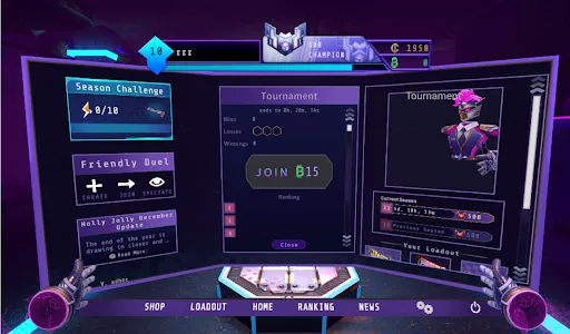
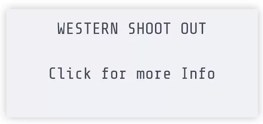
The player would be notified that a tournament was going on through the widget on the home page that is shown below here.

Clicking on this widget would open up the tournament Interface, with the progress section shown up top, the ability to join (or duel if they have signed up) and then the leaderboards underneath. This was one scrollable interface.
Since I didn't work on the first iteration, I was tasked with completely redesigning this for a more clear and scalable flow.
Requirement Analysis
The first thing I always do when tasked with a redesign is look at what the existing interface is tasked to do.
In this case the tournament UI had to:
Show a tournament was active through a widget.
Show the rank requirement for entering the tournament.
Bring up the tournament interface by interacting with the widget
Show the timer of when the tournament was to begin and end.
Allow the player to enter the tournament through a button with a price.
Show progress of wins, losses, and earnings for the tournament.
Show leaderboards for players.
I then met with the game designer to go over what new criteria must be added. In this case the tournament system was going to need to be redesigned to work for normal duel types, and the new duel type - Quickdraw Showdown.
Once the requirements were set, then I looked at what questions and information was missing that the player might need.


Generally this part is done with Post-it notes on a whiteboard but with work from home, Figma's Jam Boards let me do it digitally!
I used red for critical Issues, yellow for medium impact issues, and green for small Issues. White Post-its are for information already covered in the current version. With all these questions and criteria in mind, next began my favourite part - exploration!
Exploration
The first thing I explored was the main UI wireframes, as that was the bigger system and the functionality that would be here would translate to what the widget could show. I had some pencil drawings of these ideas but it got lost in my recent move unfortunately, but I assure you they were picasso-level scribbles.
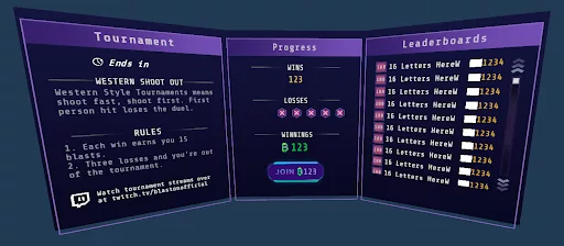
I knew an upgrade would be the context of information and where the wireframes would be placed. Currently the tournament UI was in a pop-up centered in the middle pane of Blaston’s three-paned UI. I wanted to use the entire real estate here and separate the UI into three sections into digestible areas of information:
What is a tournament and how does it work?
Sign Up and Progress
Leaderboards

Tournament Information

The information in the tournament info pane had to follow good information architecture so it was broken up into these sections:
Tournament System Heading
- Tournament TimerTournament Type
- Tournament DescriptionTournament Rules
Since the Blaston Twitch channel was starting to get more used, I thought it would be great to let players know that they could watch streams of tournament matches over there. So I added this to the left pane since it was relevant to the tournament system.

It’s also very important to consider how your interface will be scaled in the future. For the tournament UI, this could mean more in-depth rules or descriptions. Therefore this entire container would be scrollable should the content require it.
Sign Up
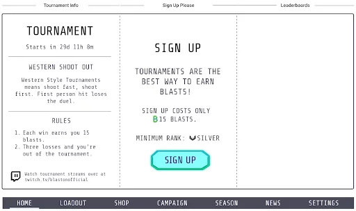
The information for sign up in the center pane was divided up to the following:
Sign Up Header
Sign Up Reason
Sign Up Cost
Sign Up Rank Requirement
Sign Up Button
This information would hopefully clarify why and how the player would sign up to a tournament. As with the UX process, iteration is key! I chatted with the programmers in the Blaston team about the sign up process, and since the widget was visible sometimes a day or two before the tournament was available (which I didn’t know) it was important we block sign ups, Luckily I always keep some negative space in the UI for these iterations and with that the disabled state was added for this time period. Luckily this didn’t interfere with the disabled state for generic sign up issues like not having the entry rank or fee.

Progress

Here this information was already present in the previous version of the tournament UI, I wanted to make sure it was readable since the text and icons were quite small and in VR especially, clarity is a big thing for various headsets like the the Oculus Quest. So this information was bumped up in size and centered with the duel button added in the center to keep the context together with the player’s progress.
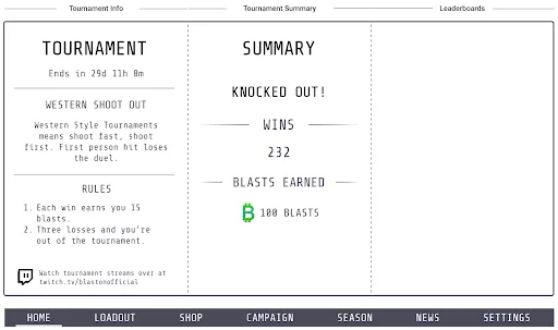
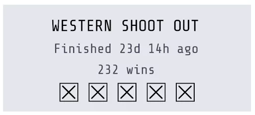
A new addition here was the “knocked out” state in the progress section. Previously the three losses would be the only way for the player to understand they finished, but we wanted to clarify this further. Now the losses were removed since they are not relevant to the player anymore and the status of “knocked out” is shown. The tournament post screen focuses on the good things the player did - their wins and blasts earned.

Once the tournament is over, the player can access the widget also for a few days so I think it is important to let them know why they can no longer play.
Leaderboards
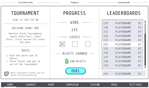
We already had leaderboards in Blaston, but I think the main thing that was interesting for the player is to know where they were in regards to the current list. Not all players would make the top X amount shown in the leaderboards, and they should be able to know how they are doing to hopefully motivate them to keep playing.
The QOL adjustments were to:
Show the player’s rank and score outside of the leaderboards as a static widget
If in the list, highlight it differently to the other players to see the contrast easily while scrolling.
Widget
The widget was next to see how we could show:
Tournament information
Timer for tournament (pre, during, and post)
Progress during the tournament
Clarity that this was an interactable element.
We had the constraint of element size to work with. It had to be the same size as the previous version so we decided to make the widget flatter with less beveled edges and focus on the information.


Here you can see the pre state, hover state, and both possible post-states for the widget!
Prototype
With all things UI and UX related, it’s very important to test it in game. I blocked in the main changes for the progress view and widget to get a feel for it and make sure things were legible using the assets I had access to.
Once I had the prefab updated in Unity, I hooked up the existing script for the previous version to make the data populate like normal, which allowed myself and the Blaston Game Designer Ben to test it out. I also updated the widget with some temp art provided by my talented colleague Isabelle, our UI Artist, to make it feel a little more like it belonged.

It was so good to see it in the live product and see things in an easier and more breathable sense than before. We tested the functionality and made some tweaks to things whilst making a list of things code would need to add for elements dynamically centering etc.
The next stage was code and UI art!
Implementation
Along with our Programmers Simon, Niklas, and Sebastian, and UI Artist Isabelle, we had to tweak certain layouts and add new use cases for certain warnings, iterating constantly until there was a candidate we were happy to release. We also changed the name to Season Challenge at this point to convey the changing event types and since the previous event was more of an endurance run rather than tournament.
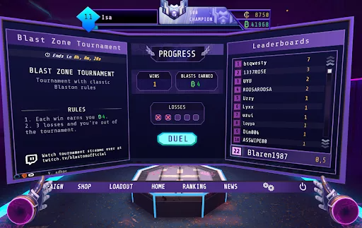
Widget Final
Here you can see the default, hover, and progress state for the widget.


Tournament UI Final
Here you can see the sign-up, progress, and knocked-out state for the Seasonal Challenge System.


Feedback
Since this was released in our latest update for Blaston - the Quick Draw update, we will now continue to monitor the feedback from players, from Discord, to streams, and post-launch feedback forms to track if we need to iterate on problem areas. So the work is never really done. Such is the design cycle of UX, you never design X and get Y, it’s usually Z or maybe a loop back to A!
Parting Words
This is one of the many projects I have worked on here at Resolution Games. Being part of the Shared Team means I get to move between all our games and work on new systems or redesigns of old systems that were made before I joined. It’s such a nice way to move between teams and work on prototypes, to in-development projects, and live games in our portfolio!
My personal goal is to visit all our games and do a pass on the systems to bring them up-to-date and give the players all the information they need to complete their tasks with minimal effort. Maybe you’ll see more of my work in the future, or have seen it in Demeo and Blaston already! Working with our talented artists and programmers, we strive for the best and to help Resolution Games deliver quality VR games each time!
You can find me on twitter @Hydroxate if you ever want to chat UX and UI about our games!