Demeo’s First Anniversary: A Look at the Evolving UX/UI of The Game
Today is the first anniversary of the launch of Demeo, and what a year it has been! We released to rave reviews, shipped two additional adventures, won the overwhelmingly humbling award of VR Game of the Year by The VR Awards and most recently expanding to an audience outside VR with Demeo: PC Edition. This is just the beginning for our dear game. To celebrate, we’re taking this moment to look back and give you a behind the scenes peek into the design journey of Demeo from our UI/UX Designer Conor’s perspective.
Conor worked in UX/UI in the tech industry before getting into UX/UI for games professionally. His first introduction to UX/UI for VR Games was when writing his masters thesis about Biometrics in Video Games - he then made a horror game in VR that used heart rate data for AI Detection Ranges.
Conor was brought on the Demeo project nine months before its release. Since launch he has been mainly involved with implementing the save system and helping create Demeo: PC Edition.
The unique UX/UI challenges of making Demeo
Demeo is an interesting challenge when it comes to UX/UI since it's a board game that we have to make sure feels good in VR with its physical interactions but also blending the physical art style (thanks to our amazing artists).
This means that we try to conform systems from the game into a physical medium that would make sense, so it really requires collaboration between the art and UX/UI teams. It also has to perform for VR headsets so you have to juggle the tech side too.
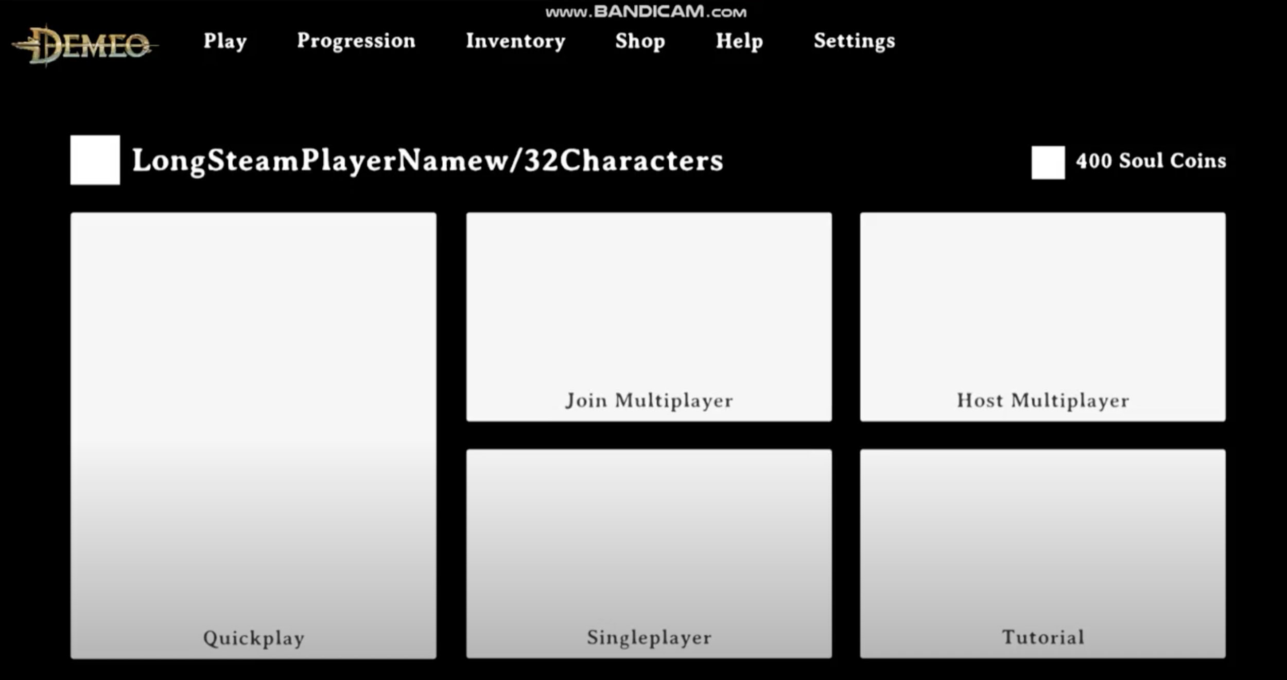
For the PC/2D version of the game, we had to use an existing game, strip away the layer of interactions and make it work for a flatscreen - an immense task! To make the UI work in a format that is accessible, readable, and scalable was tricky but then to also try and see how do controls fit in… camera movement and micro-interactions was a thing that wracked my brain for a year!
How to approach the UI/UX challenge of Demeo
For me it's always about information architecture, how do you structure information on an interface to let players understand what is going on. It's the root of everything I do. When I get a brief of a system from the design team, I immediately break it down into the information it'll require for the player at each stage the flow. I then bring this into simple wireframes so we can test straight away!
Lessons learned from player feedback
I'm always looking at our Discord for feedback on stuff that players find confusing. This helped a lot when we were starting the Demeo: PC Edition project, combined with our rounds of player testing for the game at various stages of the development, it all culminated in the final product we released. This was also very useful for us with the demo we released on Steam of the PC game since we could see what players liked or disliked and were able to quickly tweak and in some cases-redesign some of the UI.
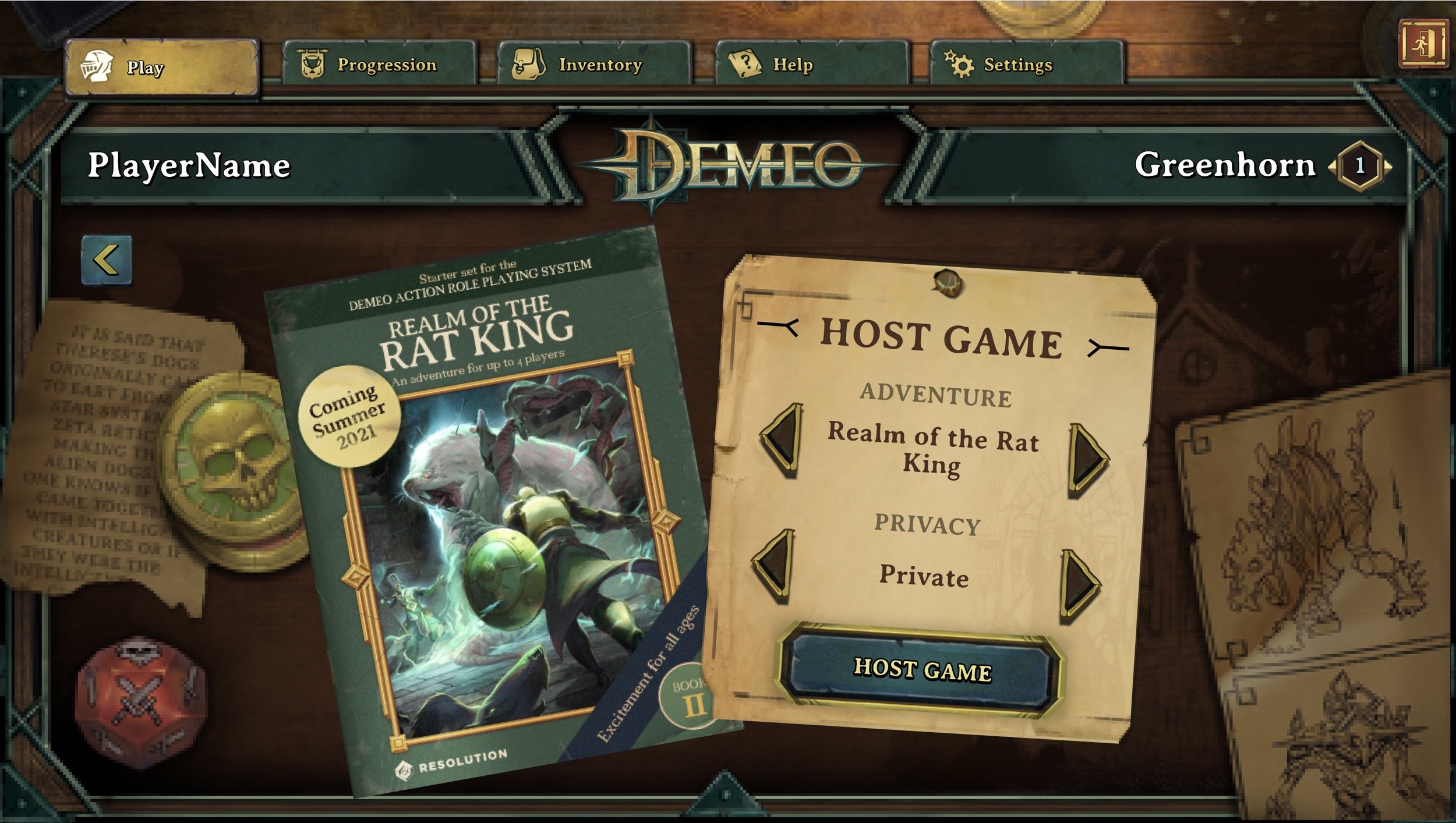
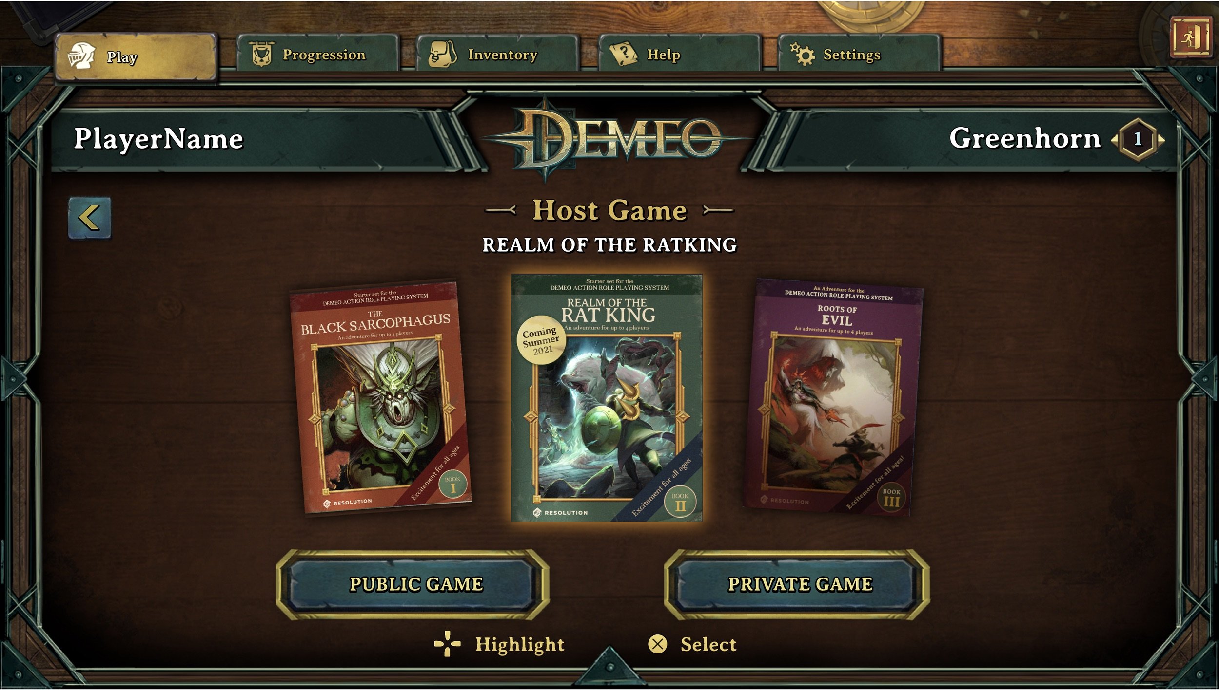
One thing that surprised me the most happened in our previous version of hosting a multiplayer game. The options to select the privacy had no title so people just skipped over it and assumed it was art. Now the host game button has two buttons for the privacy types which made it clearer. This was the same as VR so it just goes to show you, not all things translate well.
Insights & takeaways
To summarize, here are some of my biggest learnings in this project so far:
Your design is a hypothesis for the best solution, and it has to be verified with players! Only then can you truly make a great design.
Making a game like Demeo is a lot easier for the flatscreen, and it pays to think how it will be worked with a controller from the very beginning.
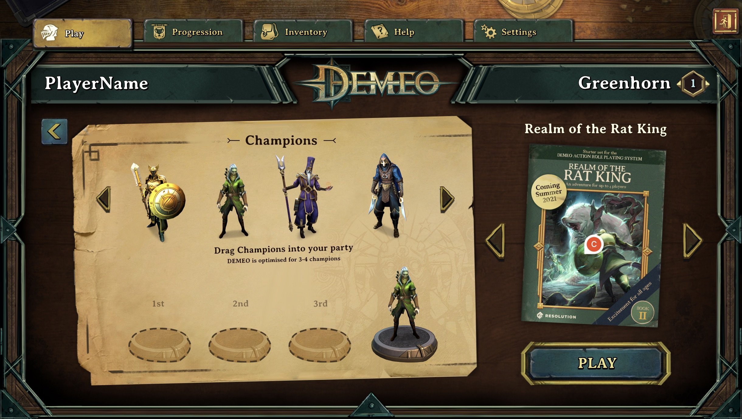
Design for scaling - think about how it'll work for more items than you start with. For example, when looking at the “adventure select” interface on PC, we had it planned for three but then we realized the roadmap for Demeo showed two more adventures in 2022. When then suddenly had to scale, scale, scale.
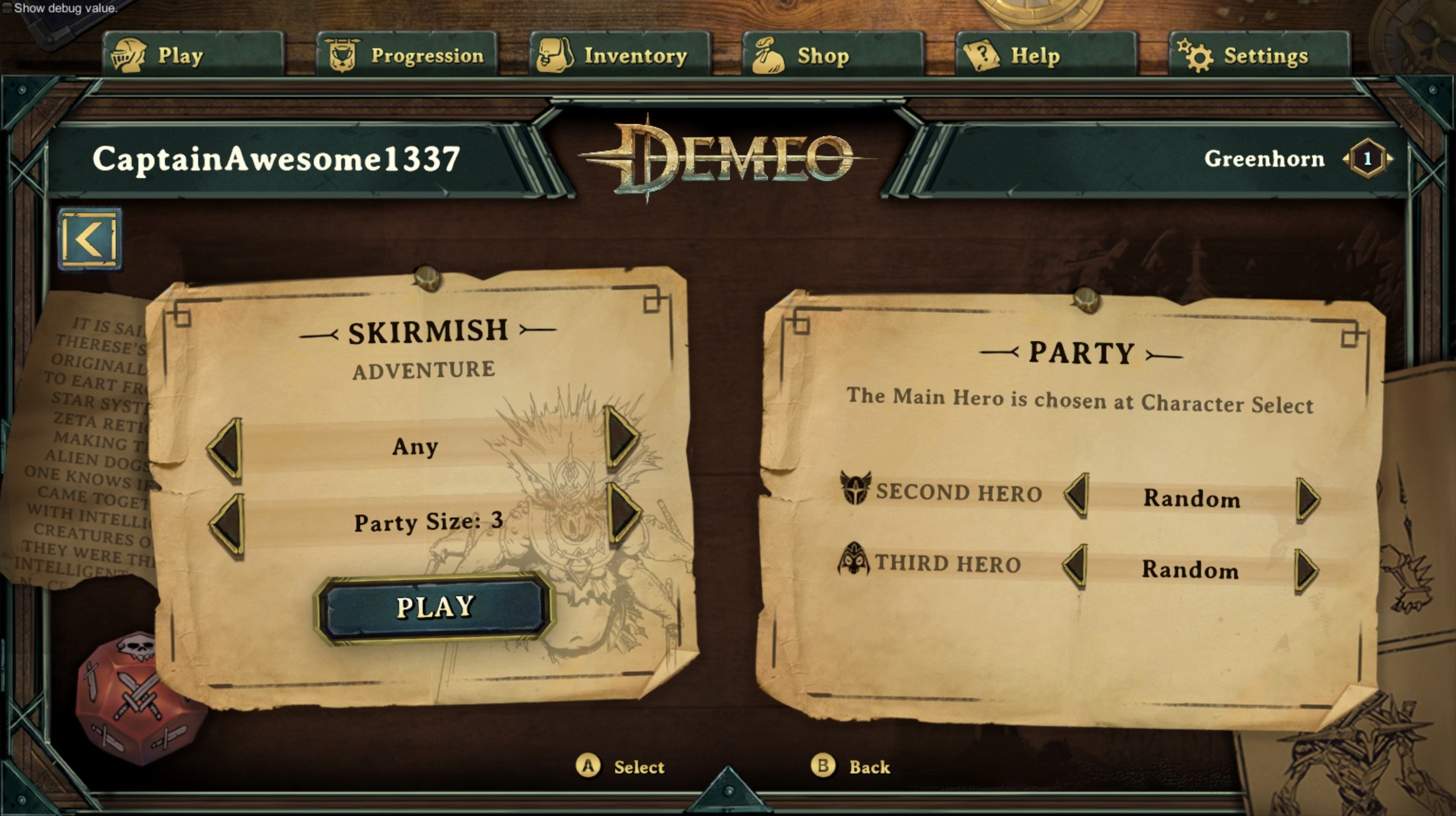
Just because you did it one way in VR, doesn't mean you have to 1:1 it for PC. You need to make it work the best way for the medium you are designing for. See the translation for skirmish mode and final version below.
If you want a deeper look into our UI/UX work, check out Conor’s detailed breakdown of the UI in tournament mode in our PvP duel shooter Blaston.
Are you interested in working at Resolution Games? We’re hiring! Go to our career page to see our open positions.